Please, Please Get Another Architect!
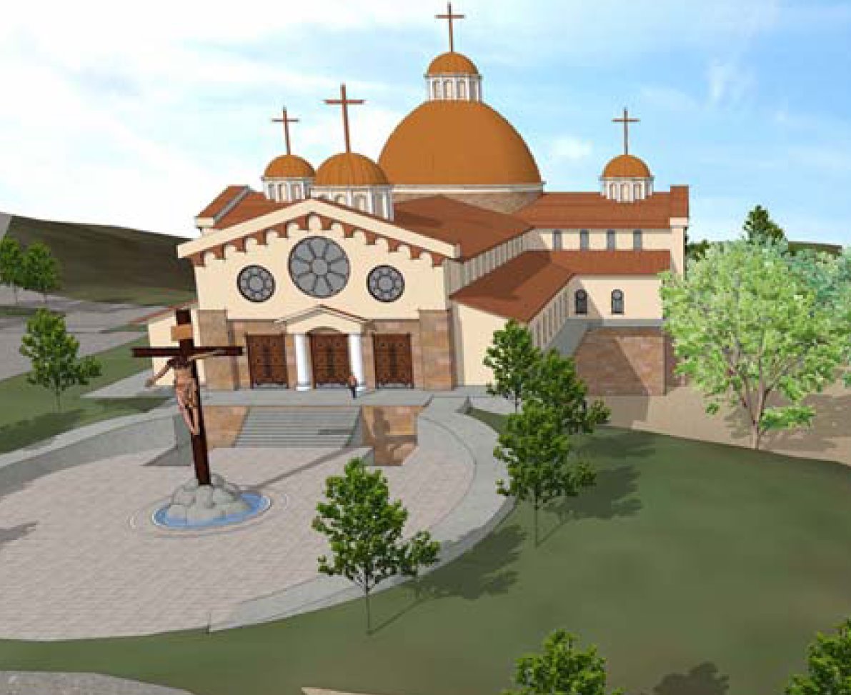
 Via Spirit DailyI read last night about a proposed new Divine Mercy Shrine on the west coast, shown here on the left. I am always happy to see fruit of the devotion to the Divine Mercy, since that devotion means a lot to me and I have had the good fortune to help with Chicago’s Sanctuary of the Divine Mercy.
But I saw something that is all too common when I clicked on the link: a well-meaning client who badly needs an architect who specializes in traditional design. I’m not out to slander the architect here… I don’t know him or anyone at the shrine. I’m sure they all mean well. The society building the shrine has great speakers at their events. But in my opinion, the architect is clearly not up to the job. As someone who wants to restore architectural beauty to the world and loves the Divine Mercy, I plead: Please, please work with an architect who understands traditional design! The average person might look at this building and say: “It looks like a church. It has domes and crosses and a beautiful site and some rose windows.” And this is indeed true. But a closer look reveals that it is essentially a cross-shaped Wal-Mart with a sloped roof and a few ill-proportioned domes. The porch out front could be located on any number of badly-designed strip malls. Its triangular pediment above the poles (which are substituting for real columns) has almost no relationship to the way pediments are intended to be made. The assemblage of part is improper, the texture and thickness of the walls gives no suggestion of traditional design. The domes are misproportioned and appear to float on the roof tiles with no structural logic. The crosses are enormously large. The red bracket-like Romanesque entablature has no relation to the rest of the design. The rose windows are just holes cut in a paper-thin wall. The lack of traditional details such as a proper entablature on the building and the portico, bases on the columns and wall, and some suggestion of how the stucco-like second story of the front facade holds up the roof really puts this design in the category (in my opinion) of “good pious try, but not good enough.”
This critique might sound like architectural quibbling, but traditional architecture has a grammar and syntax and logic proper to itself. Using the parts improperly or not using them at all is like writing a hymn which is not only not poetic, but which has spelling mistakes and subjects and verbs that don’t agree. A good Christian would not pray like that. A good Christian should not build like that either. It need not cost more. But it needs better design.
The people of the west coast deserve better than this. Christ deserves better than this. Why settle for the mediocrity of a big-box store badly dressed in ecclesiastical costume when the same hard-earned money can get a properly-designed traditional building? See examples below of new design by architects David Meleca, James McCrery and Duncan Stroik. There are many other ready and willing architects as well like Thomas Gordon Smith, Franck and Lohsen and Bill Heyer. The talent is out there. Let’s make use of it and make beautiful buildings!


