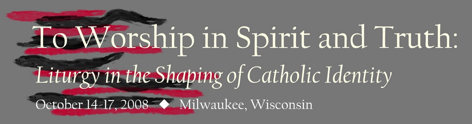
 The 2008 National Meeting of Diocesan Liturgical Commissions will be held at a convention center near the Milwaukee Airport. This event, which is the meeting of the heads and committee members of worship commissions from dioceses around the country, was co-sponsored by the Federation of Diocesan Liturgical Commissions and the USCCB Committee on the Liturgy. Here you see the logo designed for the meeting: ten scrawls of finger paint in black and red overlaid by five minutes worth of Photoshop text. Formless, hastily made, theologically vacuous, emotion-driven rather than content-driven. If this is the image that represents how the people who run liturgy for the dioceses of the nation think we should shape Catholic identity, then there is much work to be done indeed.
Leave a Reply