 I really don’t like doing negative pieces on new church architecture. Some people thrive on being snarky and critical, and there was a time when I enjoyed that too; there is a place for that sort of thing. But now, the work of critiquing inadequate, failing church architecture mostly makes me kind of sad and tired. It’s much more fun to write about the great things that are being done in the architecture world.
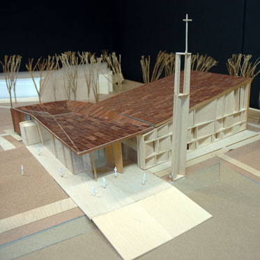
That being said, it remains instructive to comment on the sort of thing here to the left, the new chapel at Sacred Heart University, designed by one of the world’s leading Modernist-revival architecture firms, Sasaki Associates who made their fame designing for the 2008 Beijing summer Olympics. All the predictable stuff is here: concrete panels, angled walls, plate glass, walls covered in copper sheets (a little proof that the 1980s happened), a bell tower ripped right out of the architectural journals of the 1950s and the Catholic colleges of the 1970s. One has to scratch one’s head and say “Why?”. It is 2009 and we still these “slaves to the past” designs going up. Why?
Nobody wants to be mean. Nobody wants to diminish the good intentions of everyone involved or to ridicule all the work and meetings and decisions it takes to build a building. No one wants to make donors think their money was spent in vain.  But how can you say anything else about this building?
The New York Times article about the building wrote
The roof and one wall use different tones of copper to suggest the folds and fabric of a nomadic tent, a note repeated in the main chapel’s ceiling. And the clear glass of the large, inviting narthex, or entry space, opens the chapel to the rest of the campus.
What we have here is clearly a failure of ontology, that is, knowledge of the nature and being of a church. A church building is not intended to be a nomadic tent, though the unsatisfactory explanation comes  from Times article: the building was designed to represent the tent like quality of the “church as pilgrim people of God.” I’ve been in nomadic Bedouin tents, and the they don’t look like this.
A church is primarily an image of the Heavenly Jerusalem, showing us the perfection and attractive power of where we are going, not only where we are. Our Christian life is indeed a pilgrimage, but a difficult journey, and the shining, glorious vision of a radiant, ordered world draws us to continue on our pilgrimage. Similarly, the towers of Chartres Cathedral on the horizon keep pilgrims fixed on their destination.
And instead,  the university gives its students and the world a thirty year old, inadequate semi-Corbusian vision of industrially-inspired, chaotic, second rate High Modern meeting house. Evidently there is little to no eschatalogical sense at work here. Again, I have to ask: “Why?” (the university’s president said: “the fact that we are lay-led may give us the confidence we can build a building as beautiful as this and do it proudly and gratefully.” As a lay person who loves the priesthood, I’m not quite sure what to make of that.
The press is making a lot of hay out of the interior, particularly its mosaic by the famed Fr. Rupnik, SJ. One has to admit, Fr. Rupnik has  an impressive resume, having designed the mosaics for Pope John Paul II’s Redemptoris Mater chapel. And it is with a certain sense of trepidation that I critique his work (although attentive readers may note that I did it without knowing who it was some time ago in looking at his work in Lourdes). I do not know Fr. Rupnik and have no personal grudge against him, but I have to say that his work leaves me cold– perhaps its the ghoulish quality that the figures have. Perhaps people are comforted by the thought that at least there is some sort of figural imagery in a traditional medium. And indeed, the works usually have a good, deep theological program. But the manner and poses appear rather more lifeless than stylized like an icon. The large eyes appear more like children’s drawings than the traditional iconic oversized eyes which indicate a saint fixed on God. Maybe its just me. I’d be interested to hear what others have to say about Rupnik’s work.
 So all in all, not the worst chapel built lately. But certainly not the best. It reads as decidedly out of step with where the Church is today, though its baby steps in the right direction are certainly appreciated. It could have been and should have been much, much more.
Leave a Reply