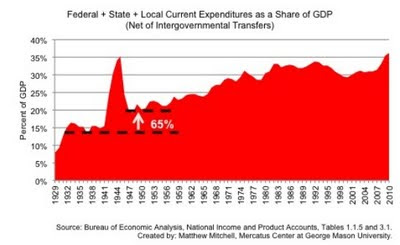
I think this is an excellent graph that shows the real spending, as a percentage of GDP, of government (Federal, State, and local).
The takeaway. Spending is at levels that we have not seen since World War Two.

In this week’s chart, Mercatus Center Research Fellow Matthew Mitchell uses data from the Bureau of Economic Analysis to illustrate the increase in the size of federal, state, and local expenditures as a share of GDP over the course of the past century.
The chart shows how expenditures as a share of GDP spiked during World War II but were reduced rapidly and significantly. However, spending never returned to the pre-war level and has followed a general upward trend ever since.
Today federal, state, and local expenditures as a share of GDP are back at the highs reached during World War II. This time, however, we are unlikely to see a swift decrease. Wartime expenditures on items like weaponry and salaries for conscripted soldiers were relatively easy to wind down. The bulk of current and future government spending is on entitlement programs like Social Security and Medicare. This variety of spending is nearly impossible to reduce in the near term.
ht Instapundit
Leave a Reply